Paper Overview
Web search is an integral part of our daily lives. Recently, there has been a trend of personalization in Web search, where different users receive different results for the same search query. The increasing personalization is leading to concerns about Filter Bubble effects, where certain users are simply unable to access information that the search engines algorithm decides is irrelevant. Despite these concerns, there has been little quantification of the extent of personalization in Web search today, or the user attributes that cause it.
Experiments
Experiment 1
The first experiment we ran was to gather real world data from actual people. We accomplished this by creating an experiment with Amazon Mechanical Turk(AMT). During the experiment the turker would visit a webpage we built and the webpage would execute all of the queries we wanted and forward all traffic through our own proxy server. For each query request through our proxy we would send two more requests as the control and then we would save all of the html files that we saw.
Experiment 2
Our second experiment was to figure out what was causing personalization. We achieved this by writing phantomjs scripts and creating a number of users that had all of the same characteristics, except one so that we can easily tell what is causing personalization between them. The different chacteristics of the users are cookies, operating system, browser, IP address, gender, age, income, education, and ethnicity. The purpose of the phantomjs scripts was to send requests to google for all of the different queries and save the results that google returned. When we run the experiment, each phantomjs instance would make a request every 11 minutes until all 120 queries have been made.
Results
After running all of the experiments, we found that there was a considerable amount of personalization. From our synthetic tests(experiment 2), we discovered the only two attributes that cause a substantial amount of personalization are being logged into Google(so you're Google account), and your location.
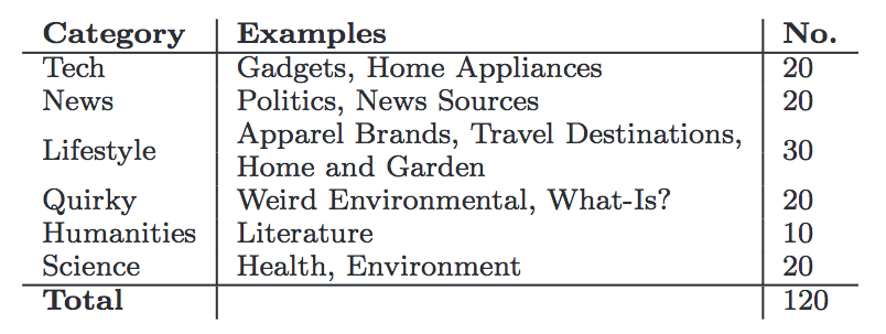
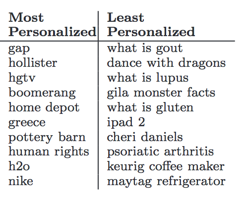
Below are a couple of images to show info about the queries we made. The image on the left shows all of the categories our queries were based on and the number of queries we made from each category. The image on the right shows the queries that had the most and least personalization.
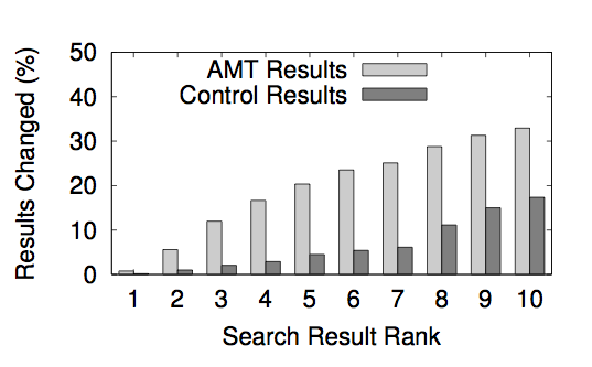
One of the things we looked at after running the experiments was the order in which Google displayed the results. The image below shows the percent of each rank that was different between the turkers in the AMT experiment.
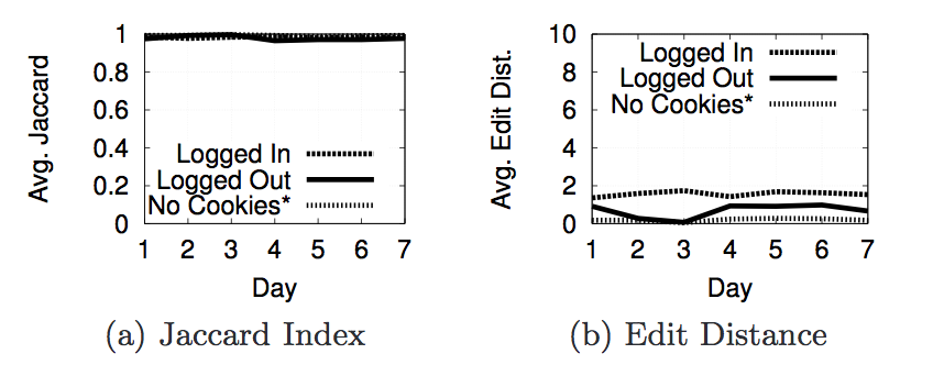
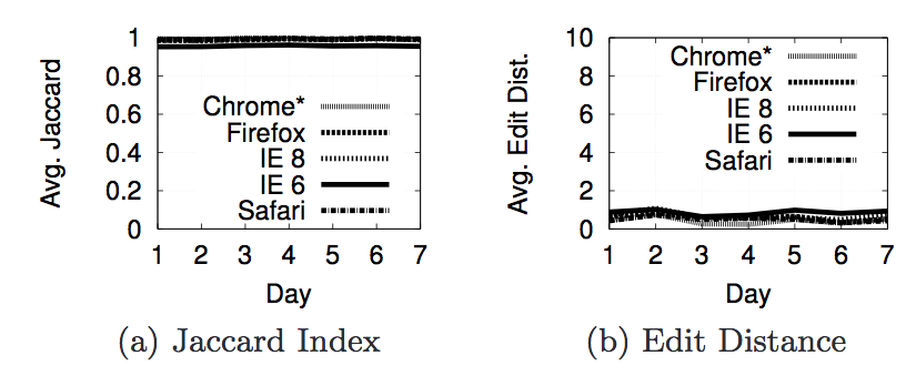
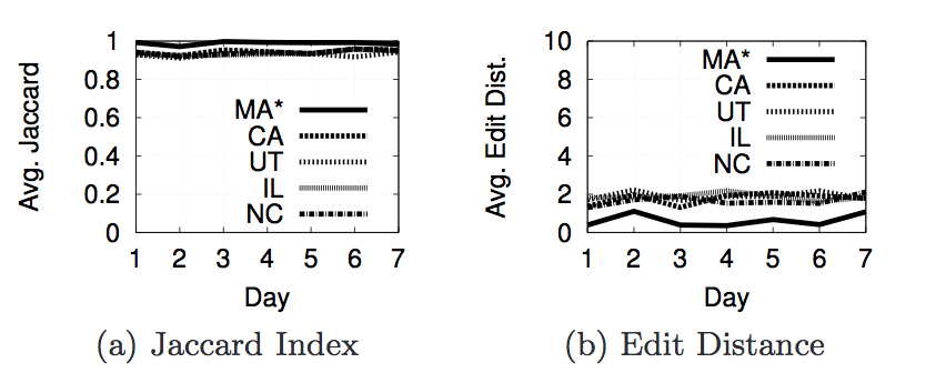
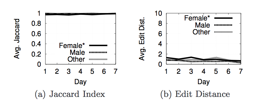
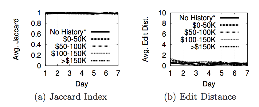
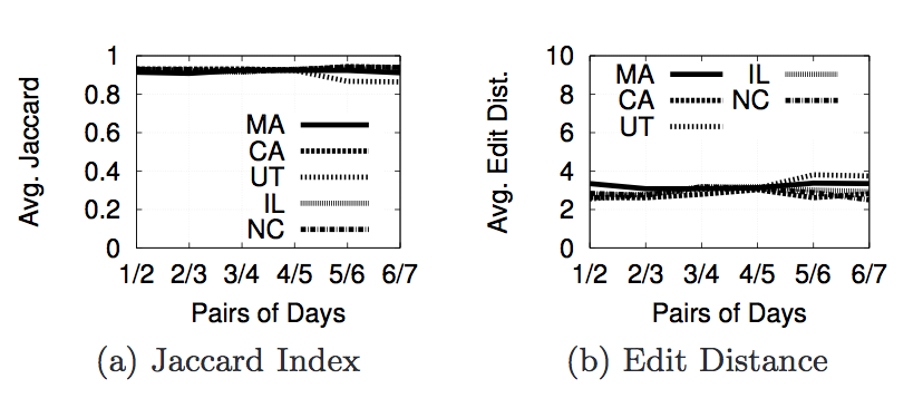
Next we are going to look at the actual results from the experiments we ran with phantomjs to decide what properties contribute to personalization. For each property we used two metrics to decide whether or not personalization occurred. The first is Jaccard Index and the second is Edit Distance(or Damerau-Levenshtein Distance). The Jaccard Index shows the similarity of the results in each page. A score of 1 says that 2 pages have the same set of results(but not neccessarily in the same order), while a score of 0 says that 2 pages do not have any of the same results. The edit distance is a metric that counts the number of elements that must be inserted, deleted, subsituted, or swapped to make one list the same as another. The next section of images shows a graph of the Jaccard Index and Edit Distance for each of the properties we tested.
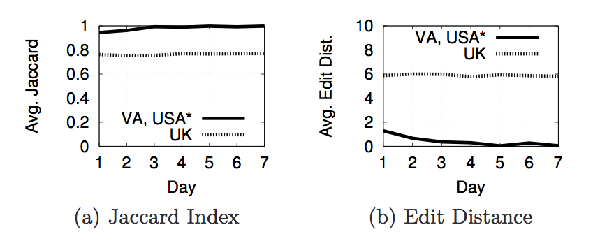
The reason for having an inferred location and geolcation is because 9 of our Amazon EC2 instances were recieving results with
.co.uk links. After further investigation we discovered that those 9 machines were in the same /16 subnet and Google was thinking that they were in the UK. After discovering this, we did not use Amazon EC2 machines for any of the results we found.
The next set of images below show the results when we compare the 1st day to the 2nd day, the 2nd day to the 3rd day, etc.
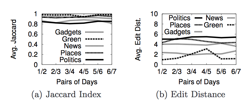
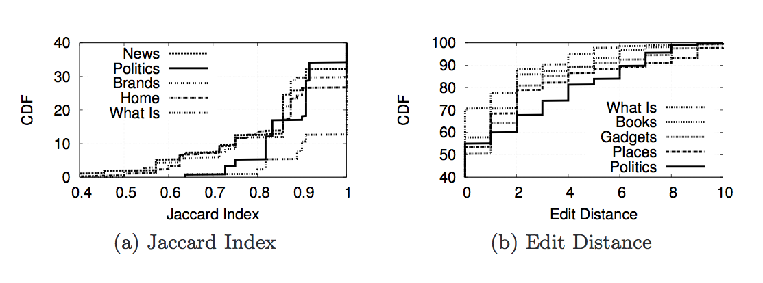
The next set of images below show the cumulutive distribution function(CDF) for the Jaccard Index and Edit Distance for 5 of the query categories. By looking at the graphs, we can see that "politics" is the most personalized category followed by "places" then "gadgets".
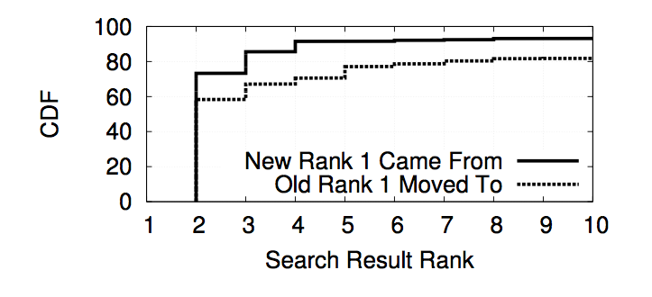
The image below is a graph that shows the likelihood of where the number 1 ranked result went to and where the new number 1 result came from if there was personalization detected. The graph is showing that the number 1 rank is most likely to stay at a higher rank while the result to replace it is most likely to come from a higher rank.
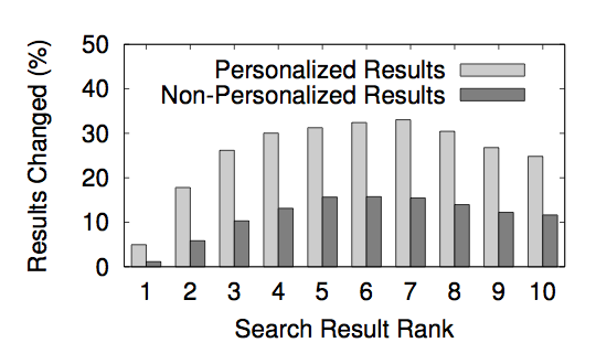
The image below is a graph that shows the percent of result ranks that are different for both personalized and non-personalized results. As the graph shows, the results in the middle of the page are more likely to be different than at either end. The ranks that are most likely to change are 6 and 7 hovering a little over 30%.
To sum it all up, we detected a significant amount of personalization for Google's search engine. The personalization we detected was due to the location of the user or the user being logged in to Google. On average we discovered an 11.7% of search results show differences in results because of personalization with the highest amount of personalization coming from queries related to political issues, news, and local businesses.
Conclusion
Over the past few years, we have witnessed a trend of personalization in numerous Internet-based services, including Web search. While personalization provides obvious benefits for users, it also opens up the possibility that certain information may be unintentionally hidden from users. Despite the variety of speculation on this topic, to date, there has been little quantification of the basis and extent of personalization in Web search services today.
In this paper, we take the first steps towards addressing this situation by introducing a methodology for measuring personalization on Web search engines. Our methodology controls for numerous sources of noise, allowing us to accurately measure the extent of personalization. We applied our methodology to real Google accounts recruited from AMT and observe that 11.7% of search results show differences due to personalization. Using artificially created accounts, we observe that measurable personalization is caused by 1) being logged in to Google and 2) making requests from different geographic areas
However, much work remains to be done: we view our results as a first step in providing transparency for users of Web search and other Web-based services
Data
Our data can be found here.
The names of the folders represent the specific feature (e.g. gender) that was tested in that experiment. Inside the folder you can find the data for each day the test was run and each value of the given feature (e.g. male, female, other, control). The HTML files contain the first page of Google Search results returned for search terms according to the filenames.
The keywords chosen for these tests are from Google Zeitgeist and WebMD. They are described in more detail in the paper.
- Figure 5 - cookies experiment. No Cookie account is the control to which logged in and logged out trials are compared.
- Figure 6 - browser experiment. The reference browser to which results returned for other browsers are compared is Chrome.
- Figure 9 - gender experiment. The reference account is Female.
- Figure 10 - search history: income level. No history account is the reference.
- Figures 7, 8, 11, 12 - influence of geolocation.
Please note, that data for real-world AMT experiment is not released due to privacy considerations.
Code
Our code can be found here. The instructions on how to use each script is below.
-
Run
python compare_pages.py page1.html page2.htmlto calculate the Jaccard and Edit distance between the result lists. -
Run
print_parse.py page.htmlto extract the results and categories from a Google results page and print them to screen. -
Run
phantomjs login_search_no_click_scenario2.jsto perform a series of searches for specified keywords without clicking on any results. -
Run
phantomjs login_search_click_scenario2.jsto perform a series of searches for specified keywords and click on specified results. -
Run
phantomjs login_browse.jsto browse a specified list of Web pages and click link within their domains. -
google.py,tools.py, andjquery-1.7.2.jsare necessary to run the scripts listed above but should not be run on their own.